
Welcoming change:
Award-winning UX &
reducing costs

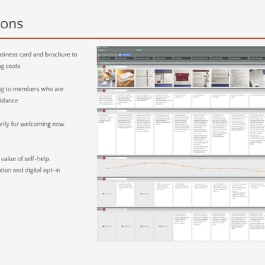
Recommendations/Journey Map
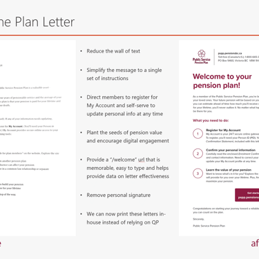
Before & after of Welcome letter
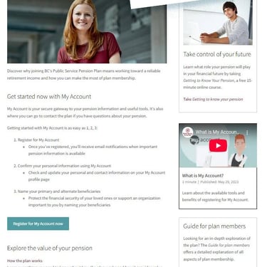
Welcome to the Plan online hub
67%
Unit Cost Reduction
$100K+ Annual Savings Realized
100%
Increased Registrations
WINNER
2022 Clear Mark Award
Reduced unit costs (producton & shipping) by 67%
Savings of over $100,000 per year, forever
New registrations for My Account increased by 100%
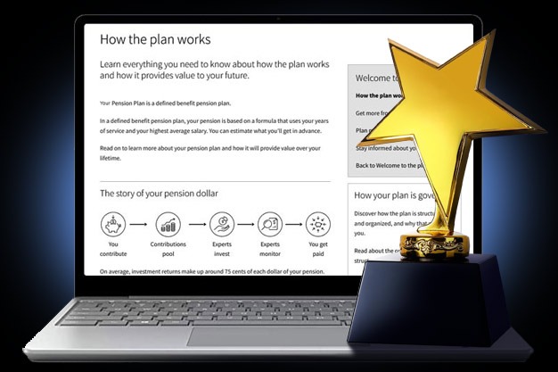
Won the 2022 Clear Mark award (Web) for online hub
The challenge
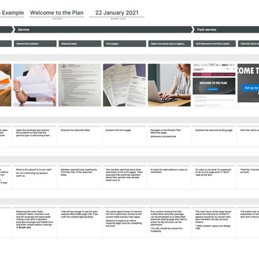
The BC Pension Corporation welcomes 25,000-40,000 new members to public pension plans annually. Every new member received an information package via Canada Post. The package was bulky and its effectiveness was unmeasured.
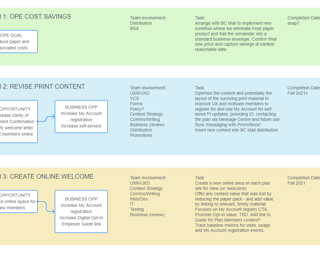
My goals were to improve the onboarding experience for new members, clarify instructions and add measurement capability. Business goals included reducing costs and paper usage, and increasing registrations to online My Account services.
My roles
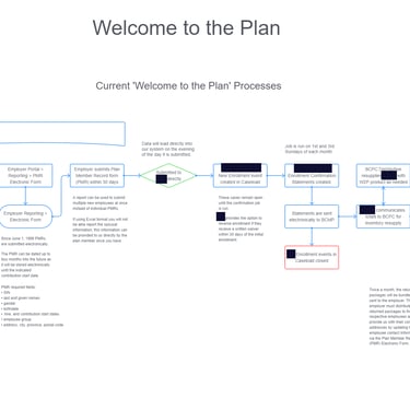
As the Service Experience Manager I interviewed new members and recorded reactions as they opened their welcome packages. I created a journey map of the experiences and made recommendations to business. I pitched a plan to reinvent the product and build a new member section online. Executive approved and I was made the project lead.
As Project Lead I researched current process and co-wrote the planning documentation with our business analyst. I created three work streams and workback schedules with the project manager, and led project team meetings for each of our production streams.


Solutions
The welcome letter was rewritten to its core message: to welcome and instruct members on what to do next, namely, to register for My Account. A simple 1-2-3 checklist, easily completed, would encourage engagement.
We simplified the enrolment confirmation form to increase comprehension and provided directions to contact employers for updates, if any were needed, to reduce call volumes.
We moved non-essential information from the package to a new website hub for new members. This was a curated experience online with links to all the information a new member would need. We created a simple url "/welcome" to be memorable, and put My Account registration as the main call to action.
I created a measurement plan to track distributions and website visits so that we could see how effective the new messaging was.
Results
By reducing the costly A4 folder, educational flyer, and business card down to a folded standard business envelope we reduced paper and shipping costs from $4.67 to $1.47 (67%). This created a savings of over $100,000 annually.
The number of My Account registrations by new members increased by 100% to 22% of all welcome package receivers. With this increase we met our registration goals for the year.
The new "Welcome" hub became a top-10 visited page on our plan sites. It provided more access to information to more members, and won the Clear Mark plain language award for Web (2022).